hist(rnorm(5000)) 
Today we will begin our exploration of some important machine learning methods, namely clustering and dimensionality reduction.
Let’s make up some input data where for clustering where we know what the natural “clusters” are
The function rnorm() can be useful here
hist(rnorm(5000))
Q. Generate random numbers centered at +3
tmp <- c(rnorm(30, mean=3),
         rnorm(30, mean=-3))

x <- cbind(x=tmp, y=rev(tmp))
plot(x)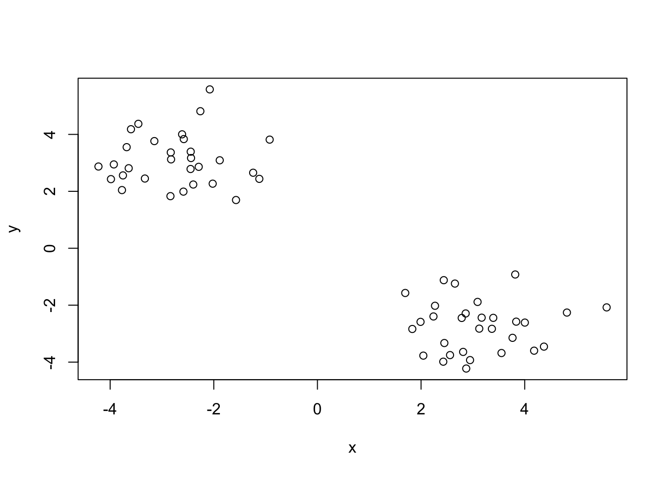
The main function in “Base R” for K-means clustering is called kmeans()
km <- kmeans(x, centers = 2)
km
K-means clustering with 2 clusters of sizes 30, 30
Cluster means:
          x         y
1  3.097738 -2.729905
2 -2.729905  3.097738
Clustering vector:
 [1] 1 1 1 1 1 1 1 1 1 1 1 1 1 1 1 1 1 1 1 1 1 1 1 1 1 1 1 1 1 1 2 2 2 2 2 2 2 2
[39] 2 2 2 2 2 2 2 2 2 2 2 2 2 2 2 2 2 2 2 2 2 2
Within cluster sum of squares by cluster:
[1] 46.89529 46.89529
(between_SS / total_SS = 91.6 %)
Available components:
[1] "cluster" "centers" "totss" "withinss" "tot.withinss"
[6] "betweenss" "size" "iter" "ifault" Q. What component of the results object details the cluster sizes?
km$size[1] 30 30Q. What component of the results object details the cluster centers?
km$center x y
1 3.097738 -2.729905
2 -2.729905 3.097738Q. What component of the results object detrails the cluster membership vector (i.e. our main result of which points lie in which cluster)?
km$cluster [1] 1 1 1 1 1 1 1 1 1 1 1 1 1 1 1 1 1 1 1 1 1 1 1 1 1 1 1 1 1 1 2 2 2 2 2 2 2 2
[39] 2 2 2 2 2 2 2 2 2 2 2 2 2 2 2 2 2 2 2 2 2 2Q. Plot our clustering results with points colored by cluster and also add the cluster centers as new points colored blue
plot(x, col=km$cluster)
points(km$centers, col ="blue", pch=15)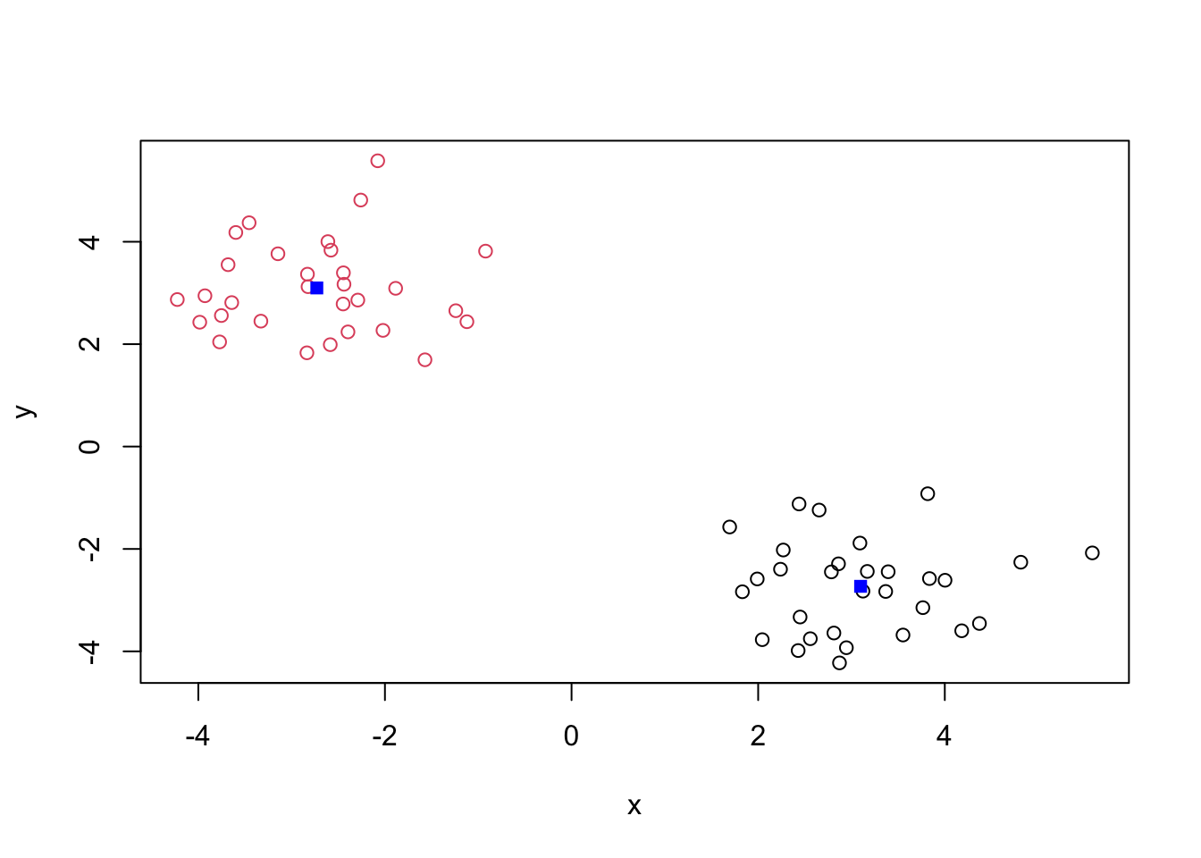
Q. Run
kmeans()again and this time produce 4 clusters (and call your result objectk4) and make a results figure like above?
k4 <- kmeans(x, 4)
plot(x, col=k4$cluster)
points(k4$centers, col ="blue", pch=15)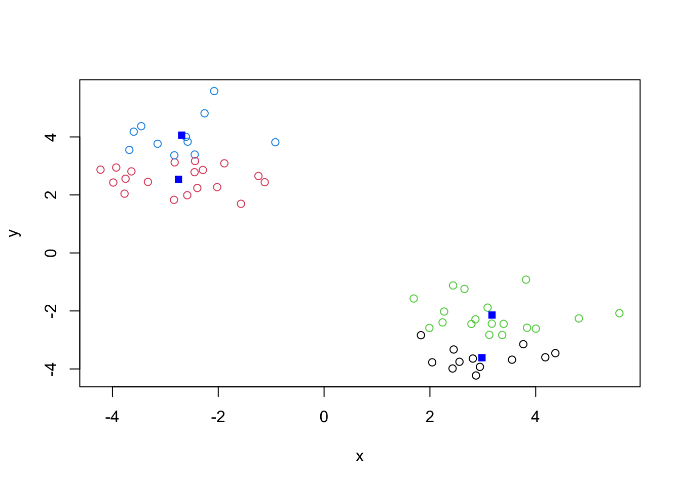
The metric
km$tot.withinss[1] 93.79057k4$tot.withinss[1] 61.77833Q. Let’s try different number of K (centers) from 1 to 30 and see what the best result is
ans <- NULL
for(i in 1:30) {
  ans <- c( ans, kmeans(x, centers = i)$tot.withinss)
}

ans
[1] 1112.633117 93.790573 77.948398 64.472849 49.093801 35.254647
[7] 30.734116 37.099975 23.933467 23.592134 19.400503 18.293143
[13] 20.573380 20.163340 16.103126 11.312376 8.570908 7.887723
[19] 6.659515 8.455084 6.310427 6.411897 5.045265 4.146576
[25] 4.455203 3.706014 3.546268 3.447812 3.587191 3.694169plot(ans, typ="o")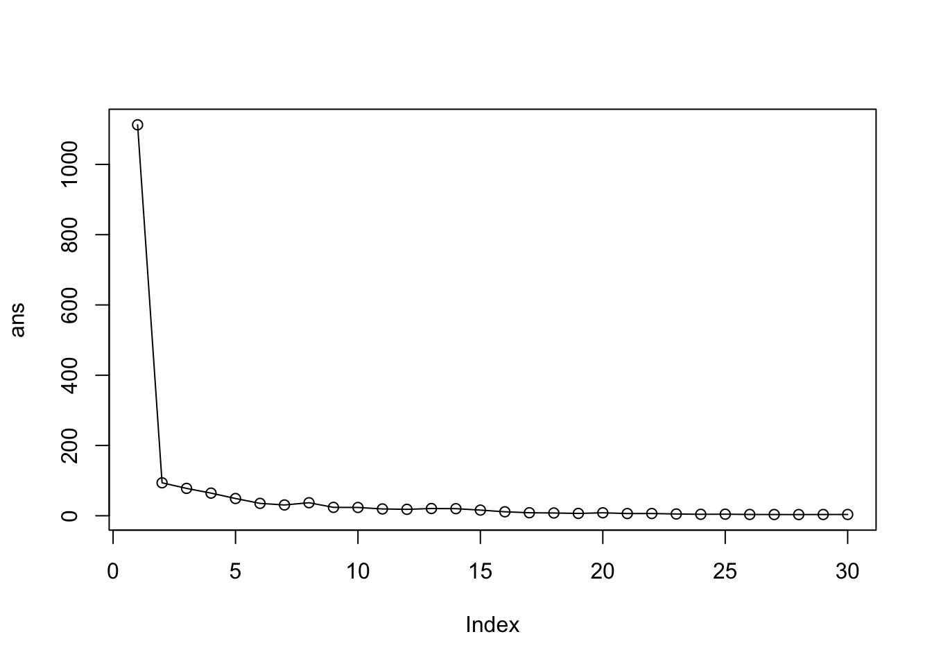
Key-point K-means will impose a clustering structure on your data even if it is not there - it will always give you the answer you asked for even if that answer is silly!
The main function for Hierarchial Clustering is called hclust() Unline kmeans() (which does all the work for you) you can’t just pass hclust() our raw input data. It needs a “distance matrix” like the one returned from the dist() function.
d <- dist(x)
hc <- hclust(d)
plot(hc)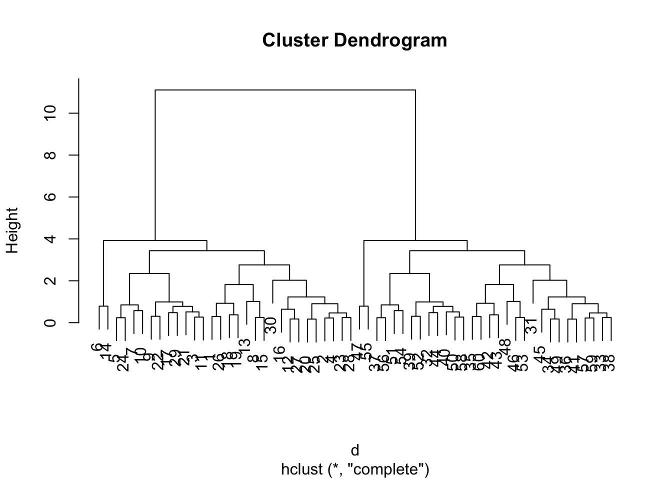
To extract our cluster membership vector from a hclust() result object we have to “cut” our tree at a given height to yield separate “groups”/“branches”.
plot(hc)
abline(h=8, col="red", lty=2)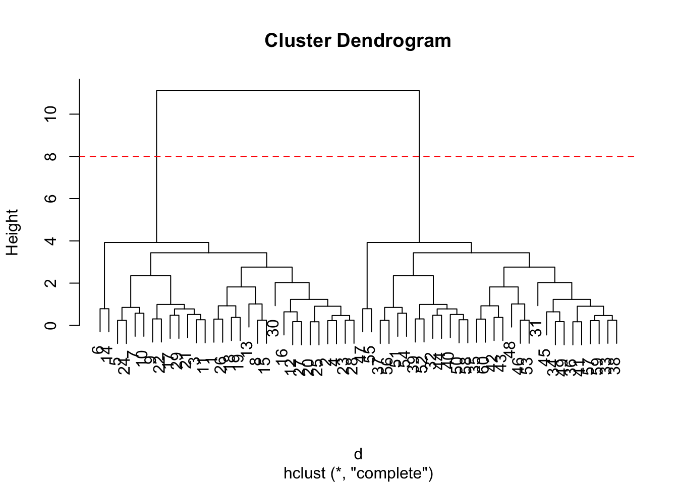
To do this we use the cutree() function on our hclust() object:
grps <- cutree(hc, h=8)
grps
[1] 1 1 1 1 1 1 1 1 1 1 1 1 1 1 1 1 1 1 1 1 1 1 1 1 1 1 1 1 1 1 2 2 2 2 2 2 2 2
[39] 2 2 2 2 2 2 2 2 2 2 2 2 2 2 2 2 2 2 2 2 2 2table(grps, km$cluster)
grps  1  2
   1 30  0
2 0 30Import the dataset of food consumption in the UK:
url <- "https://tinyurl.com/UK-foods"
x <- read.csv(url)
x
X England Wales Scotland N.Ireland
1 Cheese 105 103 103 66
2 Carcass_meat 245 227 242 267
3 Other_meat 685 803 750 586
4 Fish 147 160 122 93
5 Fats_and_oils 193 235 184 209
6 Sugars 156 175 147 139
7 Fresh_potatoes 720 874 566 1033
8 Fresh_Veg 253 265 171 143
9 Other_Veg 488 570 418 355
10 Processed_potatoes 198 203 220 187
11 Processed_Veg 360 365 337 334
12 Fresh_fruit 1102 1137 957 674
13 Cereals 1472 1582 1462 1494
14 Beverages 57 73 53 47
15 Soft_drinks 1374 1256 1572 1506
16 Alcoholic_drinks 375 475 458 135
17 Confectionery 54 64 62 41Q. How many rows and columns are in your new data frame named x: What R functions could you use to answer this?
dim(x)[1] 17 5One solution to set the row names is to do it by hand…
rownames(x) <- x[,1]To remove the first column I can use the minus index trick
x<- x[,-1]A better way to do thids is to set the row names to the first column with read,csv()
x <- read.csv(url, row.names = 1)
x
England Wales Scotland N.Ireland
Cheese 105 103 103 66
Carcass_meat 245 227 242 267
Other_meat 685 803 750 586
Fish 147 160 122 93
Fats_and_oils 193 235 184 209
Sugars 156 175 147 139
Fresh_potatoes 720 874 566 1033
Fresh_Veg 253 265 171 143
Other_Veg 488 570 418 355
Processed_potatoes 198 203 220 187
Processed_Veg 360 365 337 334
Fresh_fruit 1102 1137 957 674
Cereals 1472 1582 1462 1494
Beverages 57 73 53 47
Soft_drinks 1374 1256 1572 1506
Alcoholic_drinks 375 475 458 135
Confectionery 54 64 62 41Is difficult even in this wee 17D dataset…
barplot(as.matrix(x), beside=T, col=rainbow(nrow(x)))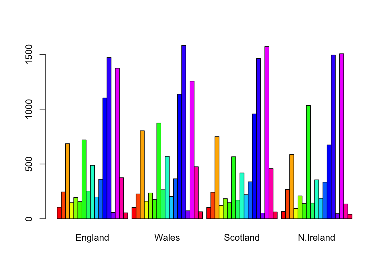
barplot(as.matrix(x), beside=F, col=rainbow(nrow(x)))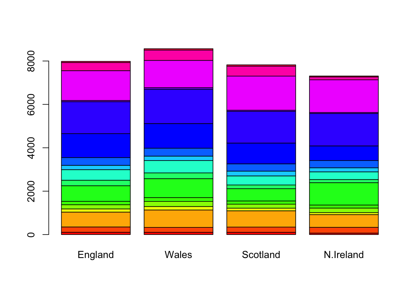
pairs(x, col=rainbow(nrow(x)), pch=16)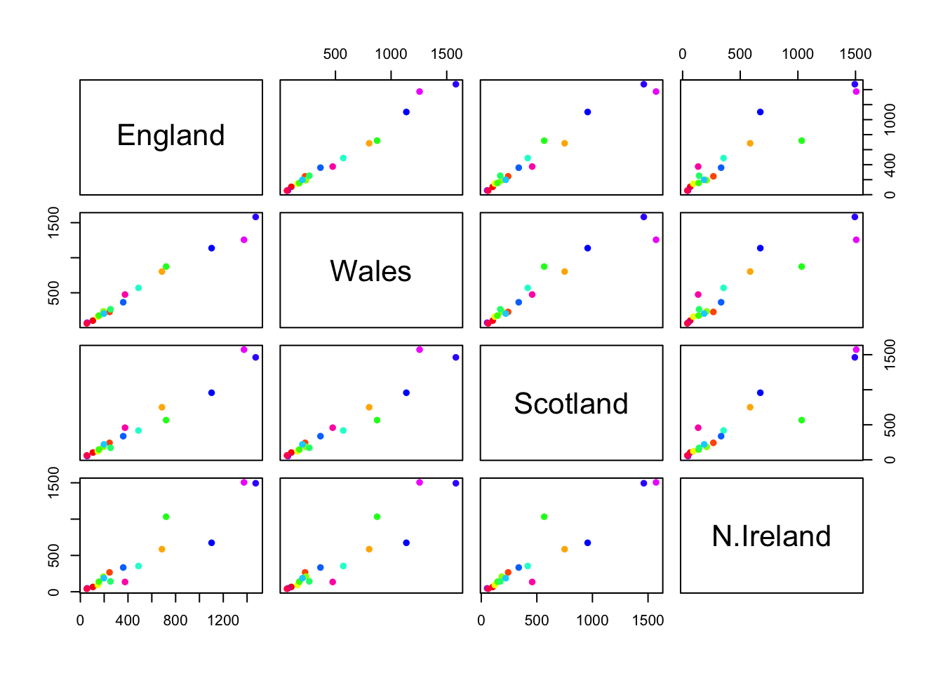
library(pheatmap)

pheatmap(as.matrix(x))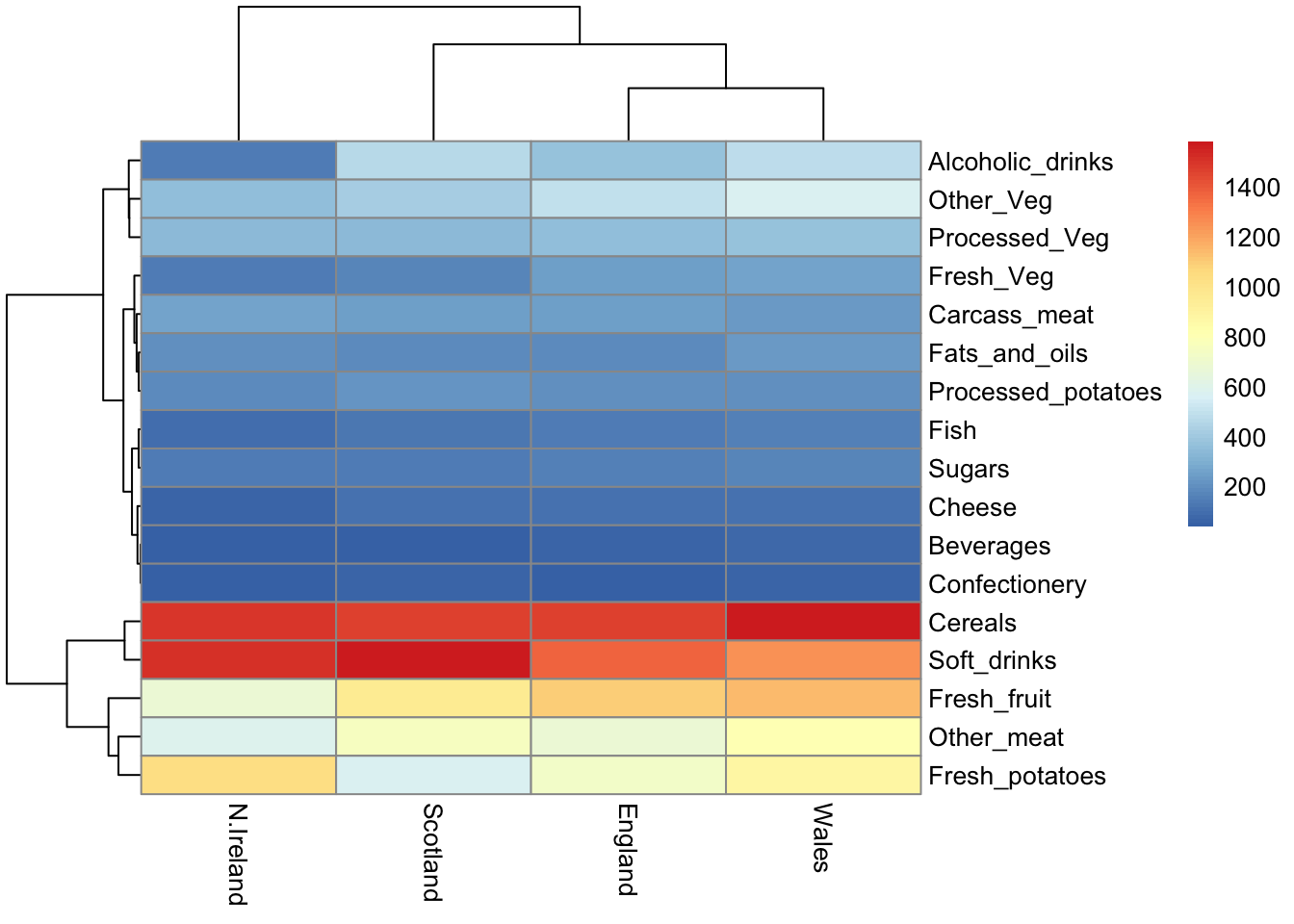
The main PCA function in “base R”
pca <- prcomp(t(x))summary(pca)Importance of components:
PC1 PC2 PC3 PC4
Standard deviation 324.1502 212.7478 73.87622 2.7e-14
Proportion of Variance 0.6744 0.2905 0.03503 0.0e+00
Cumulative Proportion 0.6744 0.9650 1.00000 1.0e+00attributes(pca)$names
[1] "sdev" "rotation" "center" "scale" "x"
$class
[1] "prcomp"To make one of main PCA result figure we turn to pca$x the scores along our new PCs. This is called “PC Plot” or “Score Plot” or “Ordination Plot”, etc.
my_cols <- c("orange", "red", "blue", "green")library(ggplot2)
ggplot(pca$x) +
aes(PC1, PC2) +
geom_point(col= my_cols)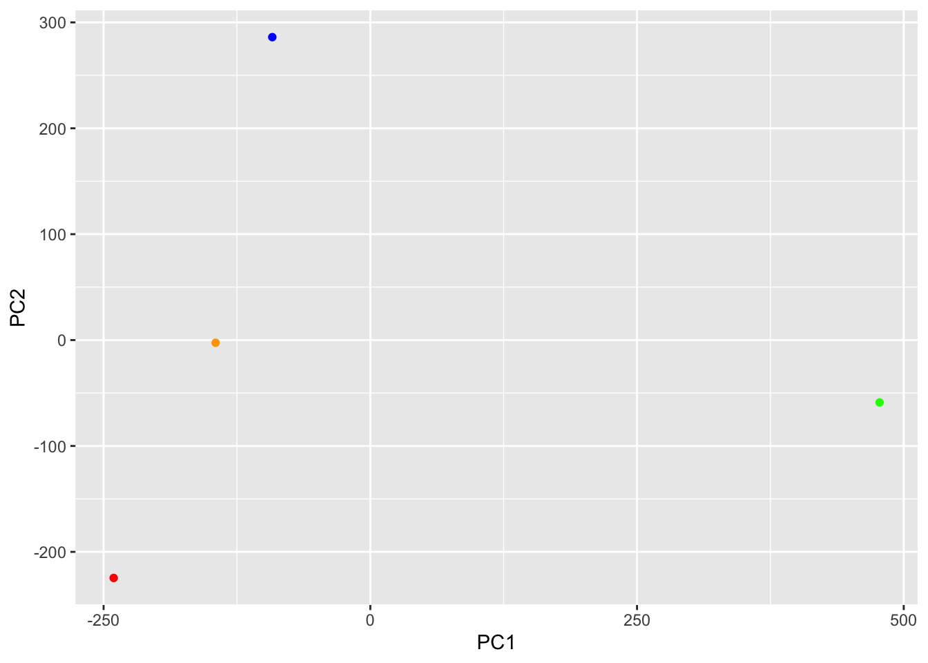
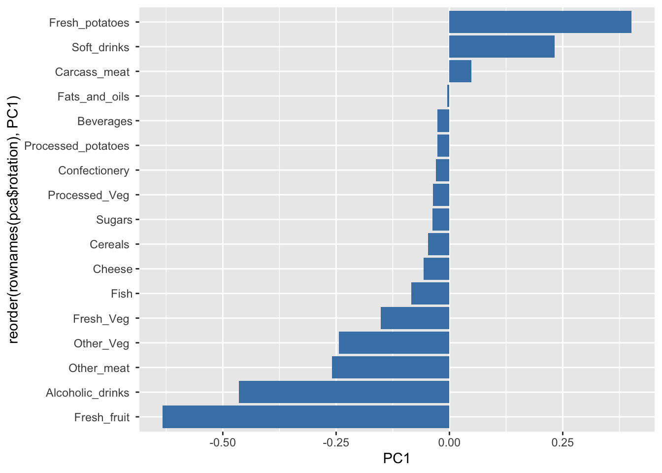
The second major result figure is called a “loadings plot” of “variable contributions plot” or “weight plot”
ggplot(pca$rotation) +
  aes(x= PC1, y= reorder(rownames(pca$rotation), PC1)) +
  geom_col(fill = "steelblue")