head(cars) speed dist
1 4 2
2 4 10
3 7 4
4 7 22
5 8 16
6 9 10There are lots of ways to make plots in R. These include so-called “Base R” (like the ‘plot()’) and add on packages like ggplot2
Let’s make the same plot with these two graphics systems. We can use the inbuilt ‘cars’ data set:
head(cars) speed dist
1 4 2
2 4 10
3 7 4
4 7 22
5 8 16
6 9 10with “base R” we simply:
plot(cars)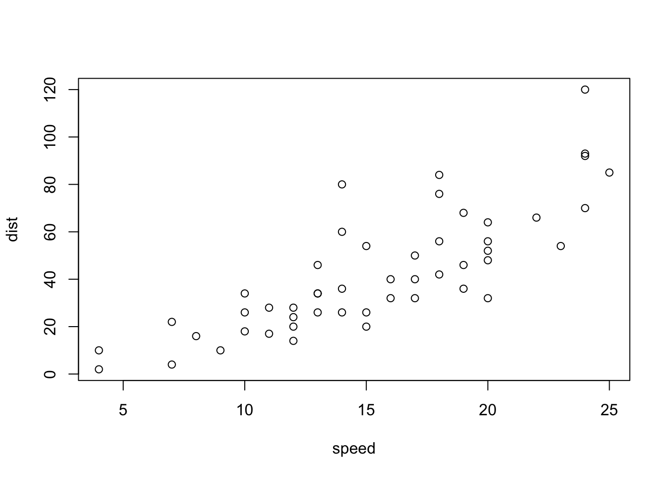
Now let’s try ggplot. First I need to install the package using install.packages("ggplot2")
N.I.K. We never run on `install.packages() in a code chunk otherwise we will re-install needlessly every time we open the document
Every time we want to use an add we must load it up using library()
library(ggplot2)
ggplot(cars)
Every ggplot needs at least three things:
ggplot(cars) +
  aes(x=speed, y=dist) + geom_point() + geom_line()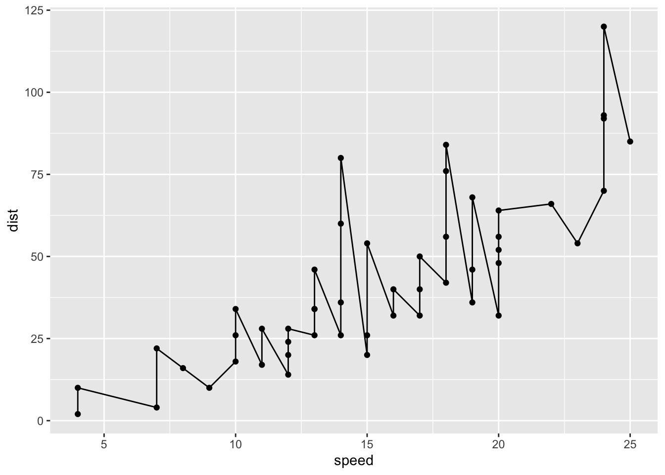
ggplot(cars) +
  aes(x=speed, y=dist) + geom_point() + geom_smooth(method="lm", se=FALSE) + labs(x="speed(mph)", y="Distance(ft)", title="Stopping Distance of Old Cars") + theme_bw()
`geom_smooth()` using formula = 'y ~ x'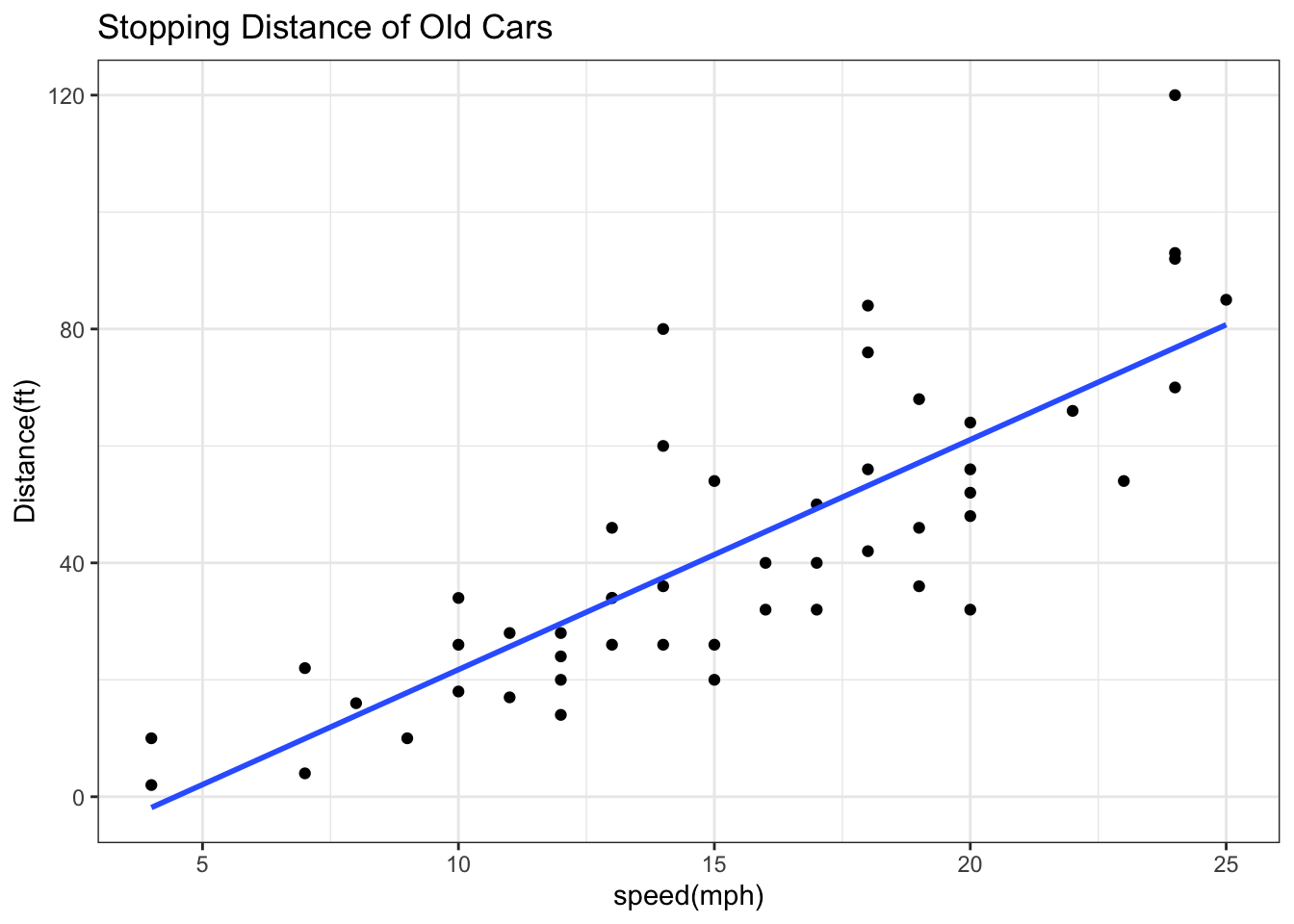
##Gene Expression Plot
Read some data on the effects of GLP-1 inhibitor (drug) on gene expression values:
url <- "https://bioboot.github.io/bimm143_S20/class-material/up_down_expression.txt"
genes <- read.delim(url)
head(genes)
Gene Condition1 Condition2 State
1 A4GNT -3.6808610 -3.4401355 unchanging
2 AAAS 4.5479580 4.3864126 unchanging
3 AASDH 3.7190695 3.4787276 unchanging
4 AATF 5.0784720 5.0151916 unchanging
5 AATK 0.4711421 0.5598642 unchanging
6 AB015752.4 -3.6808610 -3.5921390 unchangingVersion 1 plot - start simple by getting some ink on the page
ggplot(genes) +
  aes(x=Condition1, y=Condition2) +
  geom_point(col="blue", alpha=0.2)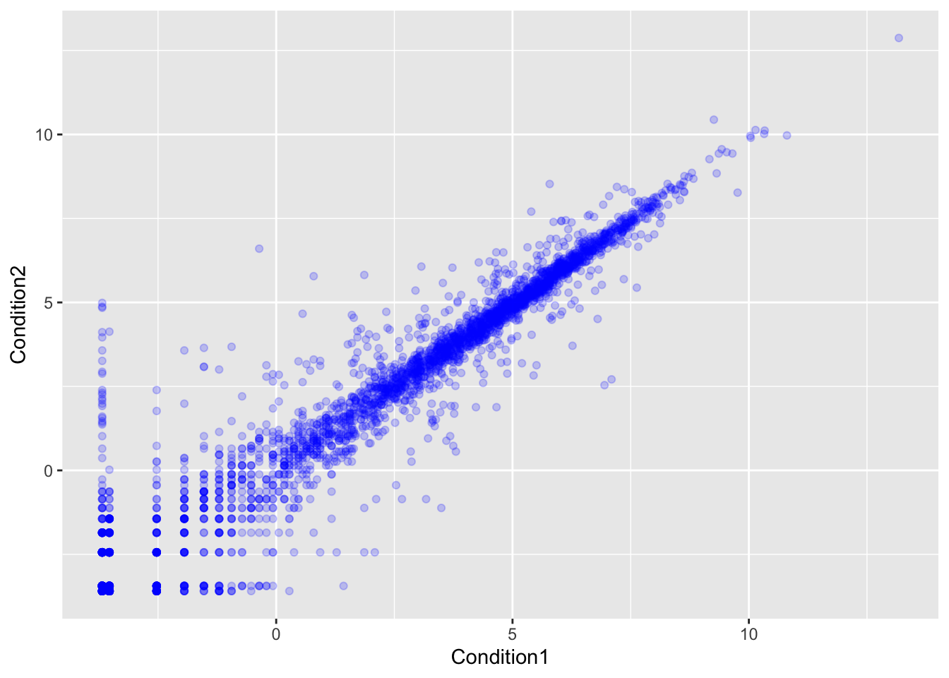
Let’s color by State up, down or no change
table(genes$State)
      down unchanging         up
72 4997 127 ggplot(genes) +
aes(x=Condition1, y=Condition2, col=State) +
geom_point() +
scale_color_manual(values=c("red",
"gray",
"blue") ) +
labs(x="Control (no drug)",
y= "Drug",
title= "Expression changes with GLP-1 Drug") 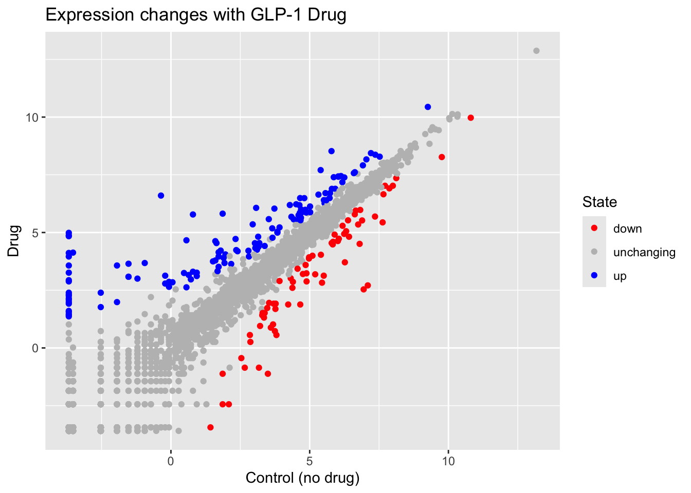
Here we explore the famous gapminder dataset with some custom plots.
# File location online
url <- "https://raw.githubusercontent.com/jennybc/gapminder/master/inst/extdata/gapminder.tsv"

gapminder <- read.delim(url)
head(gapminder)
country continent year lifeExp pop gdpPercap
1 Afghanistan Asia 1952 28.801 8425333 779.4453
2 Afghanistan Asia 1957 30.332 9240934 820.8530
3 Afghanistan Asia 1962 31.997 10267083 853.1007
4 Afghanistan Asia 1967 34.020 11537966 836.1971
5 Afghanistan Asia 1972 36.088 13079460 739.9811
6 Afghanistan Asia 1977 38.438 14880372 786.1134Q. How many rows does this dataset have?
nrow(gapminder) [1] 1704Q. How many different continents are in this dataset?
table(gapminder$continent)
  Africa Americas     Asia   Europe  Oceania
     624      300      396      360       24
Version 1 plot gdpPercap vs LifeExp for all rows
ggplot(gapminder) +
  aes(x=gdpPercap, y=lifeExp, col=continent) +
geom_point() 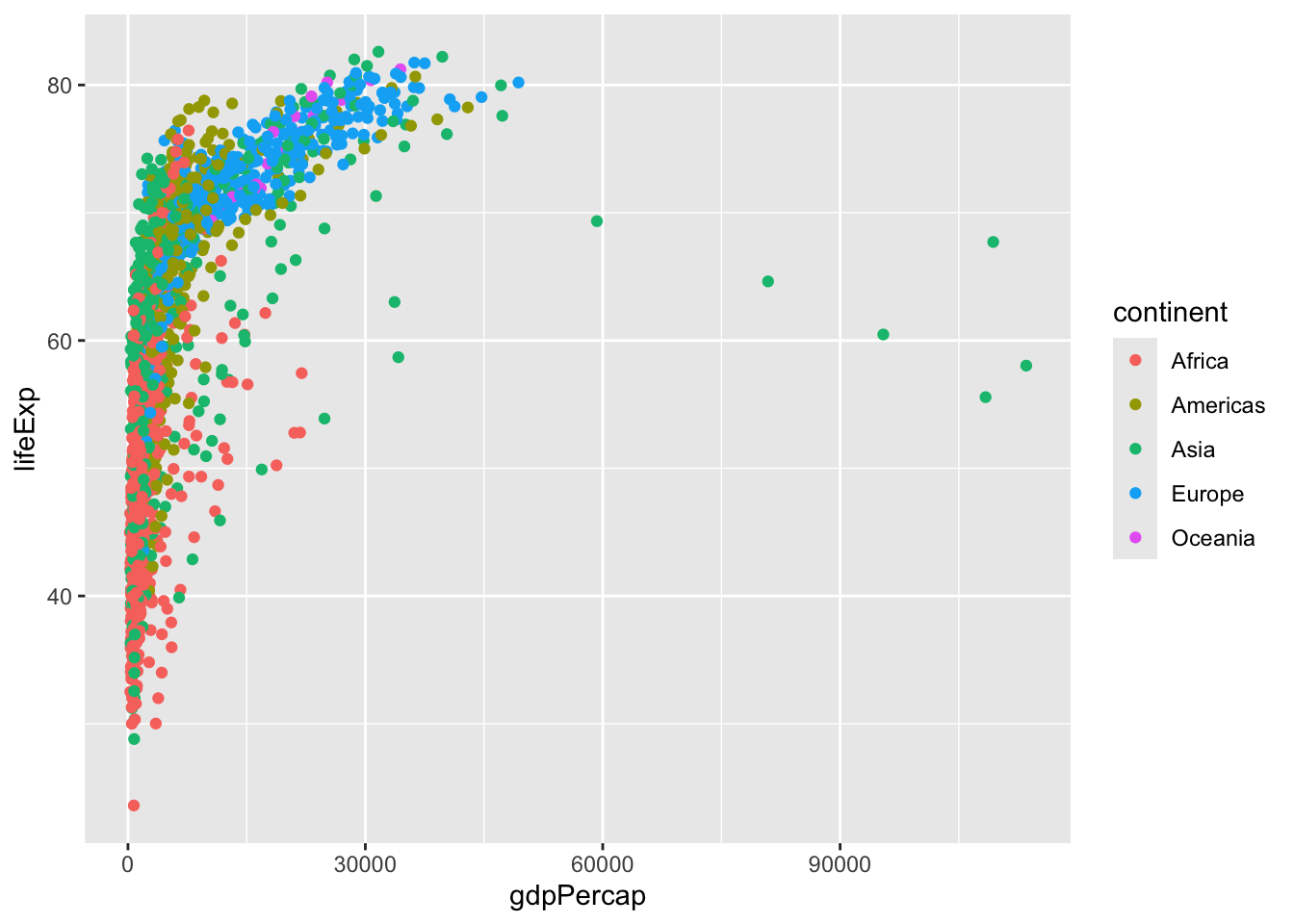
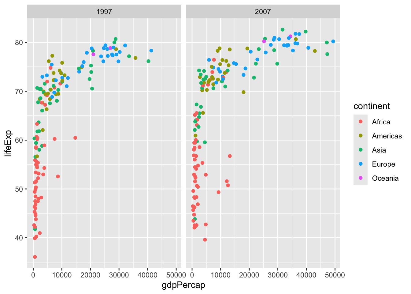
I want to see a plot for each continent - in ggplot lingo this is called “faceting”
ggplot(gapminder) +
  aes(x=gdpPercap, y=lifeExp, col=continent) +
  geom_point() +
  facet_wrap(~continent)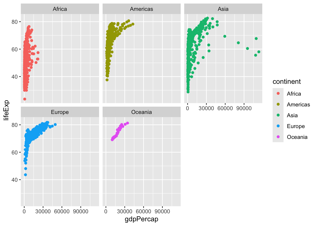
Another add-on package with a function called filter() that we want to use
library(dplyr)
Attaching package: 'dplyr'The following objects are masked from 'package:stats':
filter, lagThe following objects are masked from 'package:base':
intersect, setdiff, setequal, unionfilter(gapminder, year == 2007, country == "Ireland") country continent year lifeExp pop gdpPercap
1 Ireland Europe 2007 78.885 4109086 40676input <- filter(gapminder, year == 2007 | year == 1997)ggplot(gapminder) +
aes(gdpPercap, lifeExp, color = continent) +
geom_point() +
filter(gapminder, year ==2007 | year == 1997) +
facet_wrap(~year)